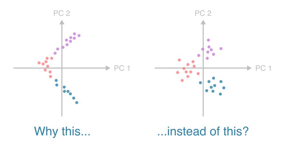
Why does my PCA have lines instead of clouds?
In population genetics, principal component analysis often squishes datapoints into thin lines with elbow-like bends. Why? Is it an alarming artifact? Where are the puffy clouds I’m used to seeing with other types of data?
To understand why populations may appear as thin patterns — “lines” and “elbows” instead of “clouds” — in a principal component analysis (PCA), let’s consider a minimal, illustrative example.
Suppose we have three populations — A, B, and C — defined by just two SNPs. Each SNP has an allele frequency of either 0% or 100% in each population (below left). These allele frequencies suggest a sequential divergence: population B evolved from A by acquiring SNP 1, and population C then arose from B by acquiring SNP 2. The genealogical tree on the right illustrates these relationships.

Now consider admixture: individuals that are genetic intermediates between these populations. Specifically, we introduce clines — population gradients — between A and B, and between B and C, but crucially, not between A and C (as a direct path from A to C is not allowed by our model above).
We define five individuals along the path from A to B to C (left), with admixture (middle) reflected in the allele frequencies (right):
![]()
When plotted in PCA space, this results in an “L”-shaped pattern of two lines representing A–B and B–C clines:
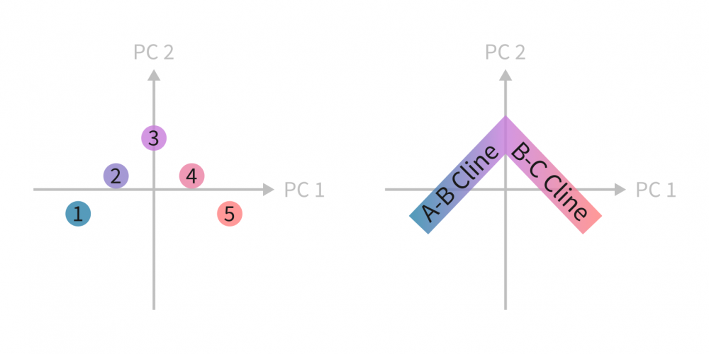
The “L” shape reflects the structure of genetic variation of two orthogonal gradients (completely separate SNPs define these gradients, leading to a right angle) and the absence of a direct A–C gradient. It is easy to see how sequential divergence of populations with, say, geography preventing admixture between certain populations may give rise to linear population gradients in the latent PCA space. This is the case even with a more realistic number of genetic variants, as long as the variants determining one gradient are separate from the ones determining another one.
This toy data of ours is sparse in the sense that certain data points in the variable space are nonexistent. Specifically, our data set simply did not have individuals with certain genotype combinations (that were not allowed by our model):
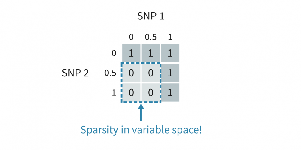
More generally, you may observe thin structures in PCAs with any type of sparse data — if the datapoints form one-dimensional patterns in the original variable space like above, they will do so in the PCA space as well.
Of note, the PCA above illustrates how the interesting latent variables — the linear population gradients — are not necessarily the same as the principal components. If the gradients were aligned with the axes, the principal components could be readily interpreted as population clines. With sparse data, it can be helpful to simply rotate the data to align with the axes, if only to give the PCs more meaning. Learn more about an approach called varimax rotation from this arXiv paper.
Finally, for homework, imagine what the PCAs of the two-variable datasets with dense and sparse spaces as indicated below would look like. In a population genetics context, what population structures or sampling strategies could they reflect? Then, to add complexity, try to imagine these patterns generalized to higher-dimensional variable spaces!

Contact us
Leave your email address here with a brief description of your needs, and we will contact you to get things moving forward!